The founder of apex.world, Juergen Schuster, had a question about using flag images in reports and select lists. As I had used flags in my Apex World Dashboard I responded and pointed him to the dashboard. But that was not an answer to the flags in the select list. I did some investigation and the answer was not so easy to find. But I found it in the end :-) and I want to share this solution with you.
Flags in reports
For the use in reports flag sprites are used. The advantage of using sprites is that you only need two files, one css file and one image file. The image file contains one large image with all the flags and in the css each country has a style pointing to the right location on the image file. So the HTML:
<div class=“flag flag-nl”></div>
results in the flag of the Netherlands:
To implement this in Apex you have to load the files
flags.css and
flags.png and upload them as static files. Refer to the CSS file on your page.
Now all you have to do is create a div in your report with the right country code. In an Oracle Apex report you can select the country code:
select lower(country_code) as country_code , country_name from countries;
Then in the HTML section of the country_code column paste:
<div class="flag flag-#COUNTRY_CODE#"/>
The text #COUNTRY_CODE# is replaced by the value in the row.
NB This value should be lower case because the class names are in lower case.
This method has been used in the
Apex World Dashboard of which a clip of the country report is shown:
Flags in select lists (only Firefox :-( )
The flag in the select list caused me more headaches. The option element is very limited with regard to styling. No child elements are allowed. The only possibility I found was to use an image as background.
Using the sprite technique above poses a problem. The size of the flag is limited by the size of the element. With the standard classes above you will only see the flag and not the rest of the content. When the width is increased, you can see the content but on the background are the other flags (from the one large image).
I looked in vain into Super LOV and select2 plugins for a solution.
So the only solution left was to collect separate flag images and use them as background for the option elements. Luckily you can find a collection of images easily on the internet. The images from http://flagpedia.net are used. With CSS3 these images are bound to the corresponding option value in the select list ( presuming it is the two character ISO country code that is returned ). A CSS file was created to bind the option values to the corresponding flags.
So all that is needed is to refer to
https://www.speech2form.com/assets/img/flags/select_flags.css on your page:
...and add the class
flag to your select item:
When you define the country code
in lower case as the return value of your select list you will see the flags in front of the country names:
In the CSS files default values for the option element have been set. You can tweak them to get the best appearance for your application. With margin and padding you can influence the spacing of the option elements.
In this solution the files reside on a remote server ( http://www.speech2form.com ).
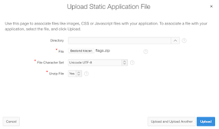
If you want the files in the database you can download
the ZIP file here. You can import the file in your application. The option to unzip should be checked.
Reference the static file
select_flags.css on your page and you can use the flag images stored in the database.
After a mornings work I find out that the background images for options only work in firefox! Sigh...
When a new solution is available I will get back to you.
Happy coding,
Dick Dral


