You know what I mean, when you ever needed to choose a country from a Select List ( > 200 items) and your pick was near the end ( The Netherlands, Unites States ). You have to scroll for 10 or 20 seconds to reach to the desired entry, and all the time you need to pay attention whether or not you have already the desired entry.
In this case it is much more user friendly to deploy the good old Auto Complete Item. Within a few key strokes, usually not more than three, the list of possibilities has been reduced to less than ten entries, and you can easily pick the right value. The only drawback for the programmer is, that the Auto Complete Item returns the description instead of the code, so the code need to be looked up before submitting the form. Not a big price for the gain is user friendliness.
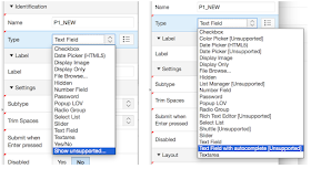
The Auto Complete item is not directly available from the list of item types, you need to choose the option Show unsupported to uncover the item type. On the right side the after pressing Show unsupported is visible.
After including the item and attaching a source query to it, it is already functional:
Okay, we can choose a value, but it does not look right, does it? We cannot read the text of some entries, the pick list is transparent and the item have list style bullets.
To fix this we need to apply a bit of CSS:
You can put it as Inline CSS on the page or in the template page, if you want to use it on several pages.
Now the item looks a lot better:
PS Do not use the Date Picker Classic, also a not supported item type, with JQM. When you put such an item on a JQM page, calling the page provides you an eternal load animation, the page is never shown.
Happy apexing,
Okay, we can choose a value, but it does not look right, does it? We cannot read the text of some entries, the pick list is transparent and the item have list style bullets.
To fix this we need to apply a bit of CSS:
.ac_results {
   background-color: white;
   border: 1px solid #cccccc;
}
.ac_results ul {
   margin-top: 0;
   padding-left: 5px;
}
.ac_results li {
   line-height: 30px;
   list-style: outside none none;
}
You can put it as Inline CSS on the page or in the template page, if you want to use it on several pages.
Now the item looks a lot better:
PS Do not use the Date Picker Classic, also a not supported item type, with JQM. When you put such an item on a JQM page, calling the page provides you an eternal load animation, the page is never shown.
Happy apexing,


Hello,
ReplyDeleteBut the css does not overlap region and buttons
Hi Marcello,
ReplyDeleteprobably this can be solved with the css properties z-index and overflow-y. \if you have an online example I can take a look at it.
Regards,
Dick